In no time we will be at WWDC21 and we will see for the first time the new operating systems for all our devices. Some operating systems that will bring news and, from what we have seen so far, a new design for application icons.
First the Mac, now the iPhone and iPad: looking for consistency
The situation is simple, last October Apple updated the App Store Connect app, which developers use to access the apps they have available in the App Store. Among the novelties he highlighted a new icon with a remarkably different design language of the previous one.

New design on the right.
As we can see in the image, the new icon shows some reliefs and some more saturated colors. In addition, the entire design is framed in a contour also with relief and following the color gradient. At the time we did not give it more importance, but yesterday Apple renewed another app.
Apple Music for Artists, the app with which content creators can view and interact with their songs and albums on Apple Music, has been updated and its icon changed. Again a design embossed and framed on an outer edge.

New design on the right.
In both cases the flat designs of the icons are left behind to add a depth that, until now, we have only seen in the icons of macOS Big Sur. It is true that both apps are aimed at a very specific type of user. Relatively few people have their content posted on Apple Music, but there are quite a few developers. They are still few compared to the bulk of users, so these design changes may not go much further, but they are enough for us to consider news.
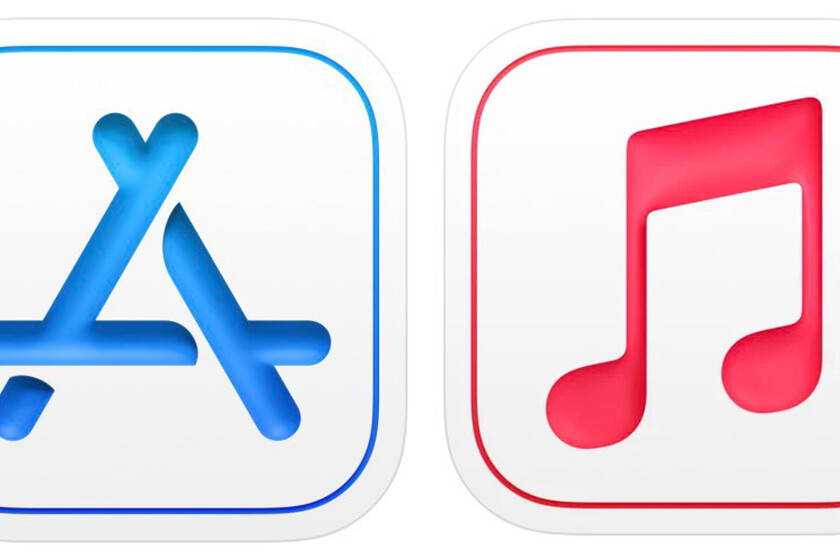
In the case of these icons, it is quite easy to imagine the icons of Apple Music and the App Store, a simple inversion in the colors, leaving the musical note and the “A” in white on a gradient background it may be the choice of Cupertino designers.

The truth is that Apple has always sought consistency between its different operating systems. With the Mac with M1 came the possibility of running iPhone and iPad apps directly on our computers and macOS Big Sur changed from round to square icons, unifying the aesthetics for both operating systems. For now we can only make assumptions about the design of the icons of iOS and iPadOS 15, but it is clear that it is a good time for a change.