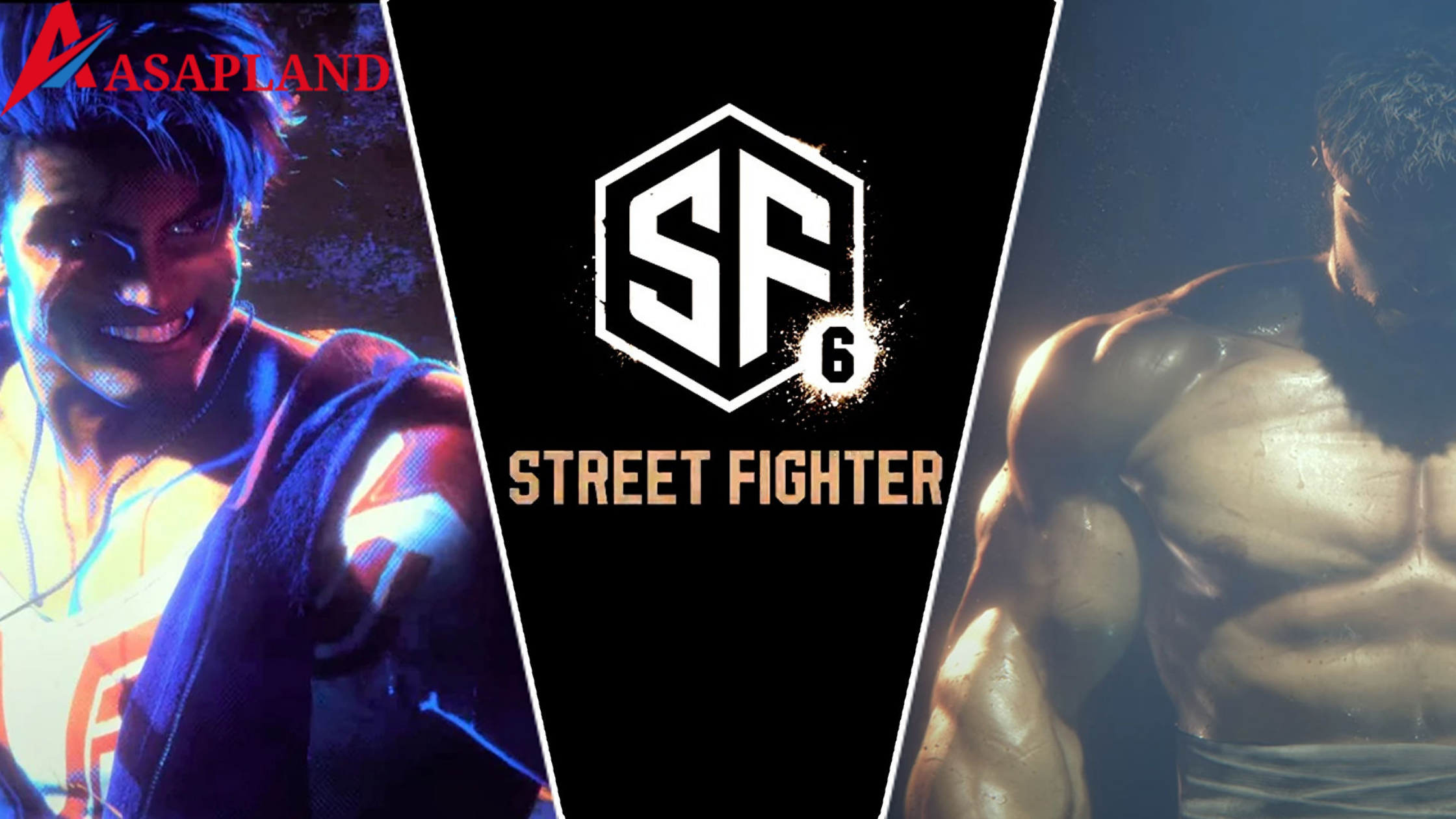
Capcom eventually introduced Street Fighter 6 at the Capcom Pro Tour season finale after a week-long teaser campaign. This year commemorates the 35th anniversary of the best fighting game series in history (sorry, Mortal Kombat lovers), as well as six years after the release of Street Fighter 5, one of the more polarising sequels to the nearly universally adored Street Fighter 4.
Not only is Street Fighter is termed to be the most renowned video game franchise of all time, but its logos are also among the best, perfectly capturing the setting and aesthetic of the games. That flashy, martial artsy font has become as famous as any of the series’ characters. Capcom maintained a clear sense of continuity from the original game’s debut in 1987 to 2016’s Street Fighter V, linking each new game to the last.
A beefed-up Ryu faces Luke, the 45th and final character from Street Fighter 5, who was teased to be in the sequel, in a short trailer for Street Fighter 6. The unveiling of Street Fighter 6 also happened to be the franchise’s 35th anniversary. Capcom also disclosed that the Capcom Fighting Collection, a compilation of ten iconic Capcom fighting games, including the entire Darkstalkers franchise. The Capcom Fighting Collection will be available on PS4, Nintendo Switch, Steam, and Xbox One on June 24, 2022.
The initials ‘SF’ are encased within a hexagon in Capcom’s design, with the letters’ edges following the curve of the border. The $80 Adobe Stock image shows the same thing — and fans in Twitter are already speculating that Capcom simply put ‘SF’ into a stock logo website.
A user named ‘xcoolee’ designed the logo on the official Adobe website, and it has previously been used publicly with some changes. xcoolee stated that they had produced the image in an interview with IGN, and that they were inclined to give out limited rights to publisher Capcom. IGN also feels that the new emblem logo is merely a placeholder and has contacted the firm for clarification.
The Street Fighter 6 logo not only looks like $80 clip art, but it also seems like an ancient Taiwanese firm logo. Sunfar 3C is a prominent electronics retailer in Taiwan that sells gaming computers, accessories, video games, and gadgets. When Street Fighter 6 was first unveiled, fans quickly likened the game’s logo to the Sunfar 3C’s, making light-hearted comments about Capcom ripping it off—which, of course, isn’t the case.
Final Thoughts
There is initially no problem with stock photos. They’re there for a reason, and many designers have found many stock image sites to be quite helpful over the years. But, if the firm actually personalised the design, couldn’t Capcom have made it a little more unique?
Even before the stock image surfaced, the new logo was far from perfect. When compared to previous zingy designs, this one appears to be more corporate – it does not conjure up visions of individuals battling in extravagant costumes on the street. Let’s just say it won’t be making our list of the best logos anytime soon.
